
Logos, Fonts & Typography
Our logo is the face of our brand—clear, confident, and distinctive. It represents our values and commitment to excellence, creating a lasting impression and unifying our visual identity across all touchpoints.
Main Logo
Please do not change, create variance or tampa with the main logo. Please reach out to anybody within the design team for help. Within this main logo asset pack, there are all-white and all-black versions; they are only to be used in extreme cases where we cannot use the colour RGB version such as third-party providers.
Download Full Set Here

The Symbol
Download PNG
Main PNG (RGB)
Download PNG
Sub Brand

Please do not create your own subbrand logo as there are a number of considerations to make. Please reach out to anybody within the design team for help.
Download Full Set Here

Main Black PNG
Download PNG
Main SVG (RGB Vector)
Download PNG
Logo laws
The Intropic logo represents our brand identity. Use it consistently to maintain recognition and professionalism.
Clear Space & Size
Keep clear space around the logo equal to the height of the "I" in Intropic.
Minimum size: 130px height (digital) or 8mm (print).
Colour Variations
Full Colour: Use on light backgrounds.
Reversed (White): Use on dark or complex backgrounds.
Monochrome (Black): Use for black-and-white documents.
Do’s & Don’ts
Use only provided logo files.
Maintain correct proportions and clear visibility.
Don’t alter, distort, or add effects.
Don’t place on busy backgrounds.
File Formats
SVG/PDF: High-quality for scalable print/web use.
PNG: For web or presentations with transparency.
JPG: For non-transparent applications.

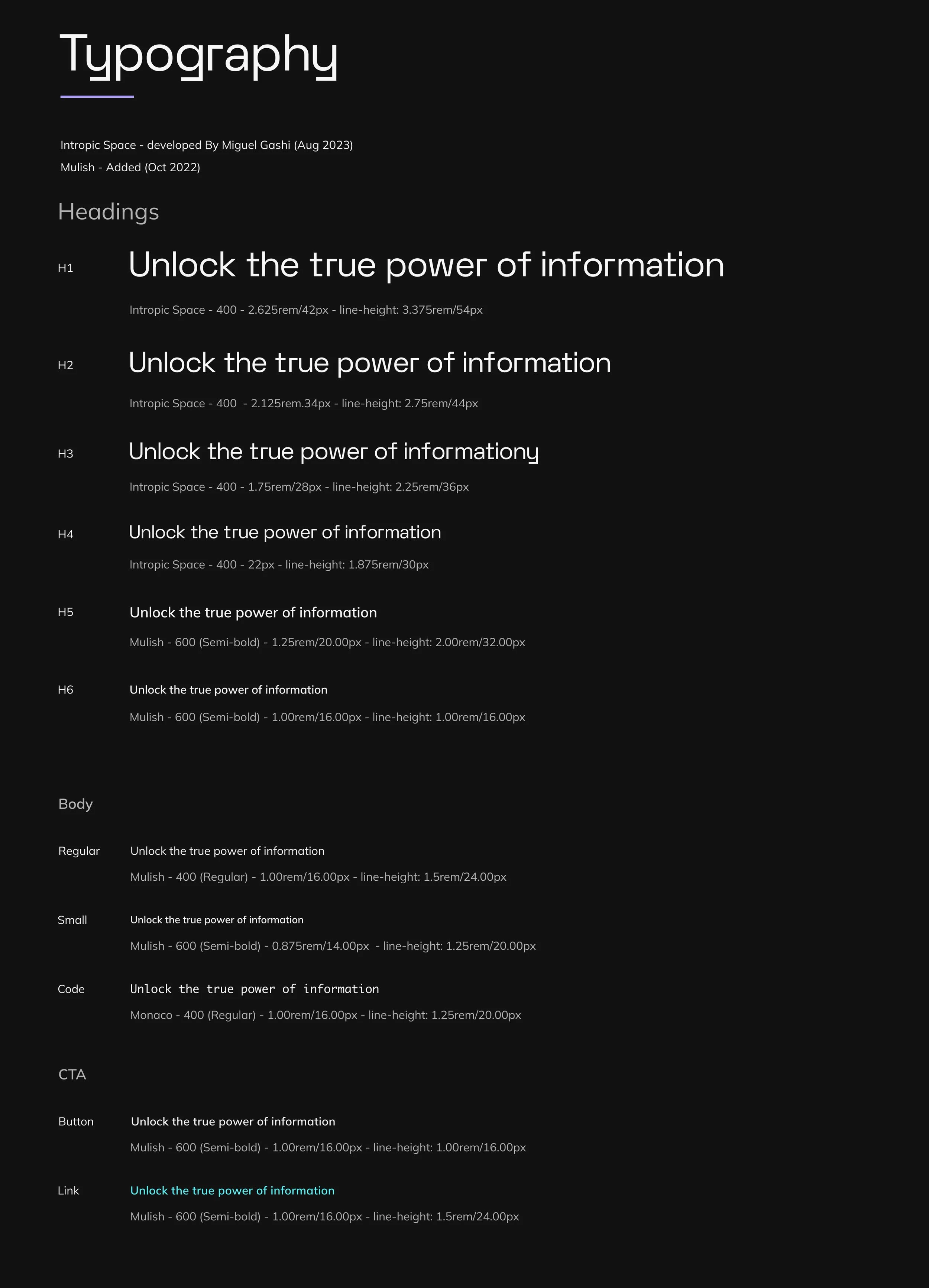
Fonts & Typography
Intropic Space defines our identity with precision, while Mulish ensures clarity and versatility across every surface.
H1 Intropic Space
H2 Intropic Space
H3 Intropic Space
Type setting
Typography is a fundamental element of our brand, as important as our logo or colour palette. It shapes how audiences perceive and interact with Intropic, ensuring a consistent and recognisable visual identity. By reinforcing trust and professionalism across all touchpoints, typography becomes a key part of our communication.
At Intropic, we use Intropic Space for all main headers in both marketing and our UI, delivering a bold and distinctive presence. Complementing this, Mulish is used for body copy, offering clarity and readability while providing supportive and directional signposting. Together, these typefaces create a clear hierarchy, seamlessly guiding users through content and embodying the essence of our brand.
PDF reference sheet
Download Type Set Styles
P1 Mulish light
P2 Mulish light
P3 Intropic Space

Fonts
Quick Links
Colours
Patterns

GTM
